Wix is one of the most popular website builders in the market. Its features and AI website builder makes it unique from other website builders. It is one of the all-in-one solutions for your marketing requirements. Besides Website builders, it has Marketing automation, domain & hosting provider, Logo maker, CRM, etc. There are around 300+ free and paid apps available in Wix to integrate with your website.
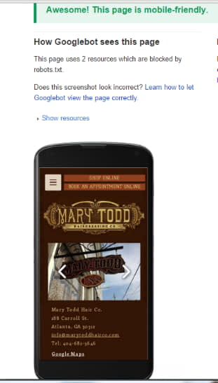
Here I tested on of the Wix template responsiveness. The score is good. However if you drag elements outside the grid, your website may not become mobile friendly.

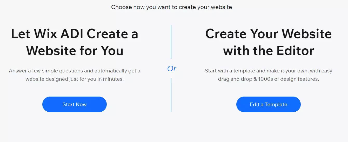
Unlike other website builders, Wix itself has different editors. Wix ADI editor is 100% mobile friendly.
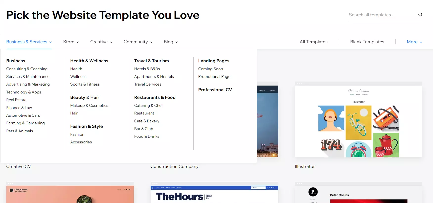
Templates & Designs
Wix has a fantastic collection of templates. There are around 500 templates available in Wix Website Builder. All are attractive and stunning templates. Its templates are categorized into Business & Services, Store, Creative, Community, and Blog. Under that, there are several sub-categories like Industrial & maintenance, Health, Landing page, Photography, Portfolio, Music, Beauty & wellness, etc.
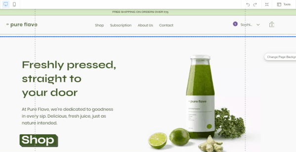
You can check any templates mobile view here (But the question is will it automatically become responsive if you drag & drop the elements. The answer is, it depends on many factors including the editor, size, grid & gap etc)

All templates are by default will be mobile friendly. Using mobile editor you can optimize it based on your needs.
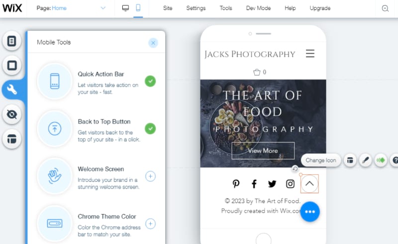
You can also add mobile specific elements that only show on mobiles such as call button that directly copies the number, opens dial & paste it automatically
Wix Responsiveness For Different Editors
Wix has 5 editors are available. Template Based editor, ADI editor, Editor X, Mobile editor, Code editor. The thing I have to tell you is, all templates are not responsive and optimized for devices like desktops, and mobiles. Sometimes it will not be fully responsive on mobile devices. But you can do it manually by yourself using mobile editor. You can make a website fully responsive. In the case of Editor X, all the templates are fully responsive. You don’t have to do anything.

Wix has a mobile editor. You can just preview how it looks on Mobile devices and adjust the elements to make it mobile-friendly.
How to Make Responsive Designs in Wix?
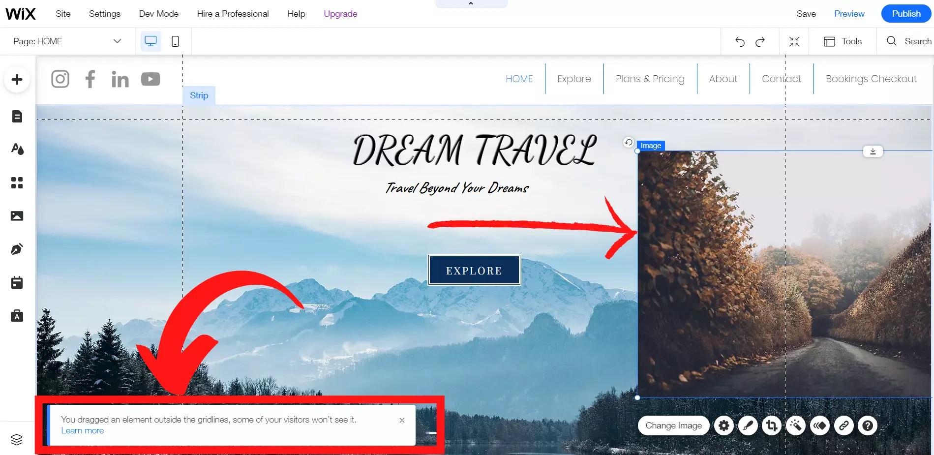
The main reason the website is not fully responsive is its elements. The elements in the Wix editor are not full-width elements. For making it responsive, you have to use full-width elements like columns, stipes, slide shows, galleries, etc. The images, boxes. text box, etc. can’t make it full width. So, you have to place the elements inside the grid lines for making the elements responsive. You will get the “Grid” option in the tools from the editor.
If you use elements inside the grid line, it will be responsive on all devices. You have to place all the contents inside the gridline. Otherwise, you will get a notification that “You dragged an element outside the gridline, some of your visitors won’t see it”. It may not be visible on mobile devices and tablets. So, you have to be aware of that.
If you change the mobile view, it won’t affect the desktop view. It will remain the same. First, you have to design the desktop view. Then you can edit the mobile view. So, after making every change in the desktop view, you have to check the mobile view also. For changing the view from Desktop to Mobile, there will be an icon for Desktop and mobile. You have to click the mobile icon. Then you will get the mobile preview of your Website.
Other things to make sure that the website is responsive:
- Drag and drop elements in the correct position.
- Delete the spaces between the sections.
- Make sure font size, and alignments are correct.
- Hide elements that are not needed to view on mobile devices.
- Stretch the columns if needed for a better preview.
- Setting the viewport meta tag. It will control the width of the viewport and it will be responsive on all devices.
So, for fully responsive templates, you can either use Wix ADI or Editor X. If you are using Wix Website with the editor, then you have to make your website responsive by using the mobile editor. All the features available in the normal editor will be available in both Wix ADI and Editor X. The difference is you won’t get full control over the website customization. Other than that, if you need fully responsive websites, you can use Wix ADI or Editor X.

Sophia Gilbert is an Email Marketing Specialist and Web Application Expert with 10+ years of experience. She meticulously tested and used most of the email marketing tools & website builders in the real field. Here she is sharing reviews and comparisons of different email marketing tools based on her past experience through different companies where she has worked.
")


")

